Page 1 of 4
Case Study: Musescore (FLOSS cross-platform sheetmusic/scorewriter) UI/UX
Posted: Fri Nov 09, 2018 12:09 am
by Kunda1

MuseScore is a free scorewriter for Windows, macOS, and Linux, comparable to Finale and Sibelius, supporting a wide variety of file formats and input methods.
Features
- WYSIWYG design, notes are entered on a "virtual notepaper"
- TrueType font(s) for printing & display allows for high quality scaling to all sizes
- Easy & fast note entry
- Many editing functions
- MusicXML import/export
- MIDI (SMF) import/export
- MuseData import
- MIDI input for note entry
- Integrated sequencer and software synthesizer to play the score
- Print or create pdf files
Infrastructure:
Qt5
QML
Version: MuseScore version (64-bit): 2.3.2, revision: github-musescore-musescore-3543170

- This is their 'Start Center' I think it's coded in Javascript
- Musescore-Start-Center.gif (308.44 KiB) Viewed 6477 times

- Notice the gradient metallic background
- Musescore-dropdown-ui.gif (163.62 KiB) Viewed 6477 times

- sleek design, gradient-like metallic color
- Musescore-Sidebar.gif (600.97 KiB) Viewed 6477 times

- Plugin Manager is very clean, tight and sharp
- Musescore-Plugin-Manager.gif (234.09 KiB) Viewed 6477 times
Re: Case Study: Musescore (FLOSS cross-platform sheetmusic/scorewriter) UI/UX
Posted: Fri Nov 09, 2018 12:58 am
by triplus
OK therefore i see it has Start dialog, File manager, rearrangeable Dock Widgets and a Package manager. Layout is rather familiar (if you are a FreeCAD user).
Where do you feel we are lagging behind compared to MuseScore?
Re: Case Study: Musescore (FLOSS cross-platform sheetmusic/scorewriter) UI/UX
Posted: Fri Nov 09, 2018 1:22 am
by Kunda1
It's a case study not a critique. Maybe we can garner inspiration from this project, IMO one of the few that really show how it's possible to soup up a Qt interface.
I'm simply pointing out the sleek and IMO classy gradient that the UI has.
Their Start Center is actually a dialog window and incorporates some interesting methodology to display information.
Their sidebars feels a little bit more reactive and 'crisp' (for the lack of better term).
The plugin manager is clean and (it has a quirk when toggling between different plugins but beside that) it contrasts very well with the background so information is clear.
Re: Case Study: Musescore (FLOSS cross-platform sheetmusic/scorewriter) UI/UX
Posted: Fri Nov 09, 2018 12:51 pm
by yorik
Very elegant and clean interface indeed... There is one thing that is important to note there, though, is that the musescore workflow seems way simpler than FreeCAD. They have a fraction of the tools we have
Good ideas I see there are
1) have a small "promotional" panel on their start page (but, what would we put in it if we had one...)
2) the "preview/description" pane on the addon manager, this one is really good, small and useful
3) a nice palettes menu. Need to look better at how that works..
Re: Case Study: Musescore (FLOSS cross-platform sheetmusic/scorewriter) UI/UX
Posted: Fri Nov 09, 2018 2:52 pm
by Joel_graff
My nine-year-old has been obsessed with MuseScore for the last two weeks... I've paid no attention to it...

That said, after briefly reviewing the layout depicted here and the comparative layout in FreeCAD, I don't think we're that far from achieving something as elegant as MuseScore.
@yorik points out that we likely support more complex workflows in our UI than does MuseScore. I'll grant that. But we divide that complexity across workbenches, and interacting with specific tools is typically handled in the same way: using the Model / Tasks dialogs in the side panel. The only increased complexity that I see in the FC UI, really, is the additional windows at bottom (typically the report view and the python console for most of us...)
Really, IMO, @ickby's prototype UI is where it's at if we want to get serious about addressing UI functionality.

Re: Case Study: Musescore (FLOSS cross-platform sheetmusic/scorewriter) UI/UX
Posted: Fri Nov 09, 2018 4:12 pm
by Kunda1
yorik wrote: ↑Fri Nov 09, 2018 12:51 pm
There is one thing that is important to note there, though, is that the musescore workflow seems way simpler than FreeCAD. They have a fraction of the tools we have
Of course!
Joel_graff wrote: ↑Fri Nov 09, 2018 2:52 pm
@yorik points out that we likely support more complex workflows in our UI than does MuseScore. I'll grant that. But we divide that complexity across workbenches, and interacting with specific tools is typically handled in the same way: using the Model / Tasks dialogs in the side panel. The only increased complexity that I see in the FC UI, really, is the additional windows at bottom (typically the report view and the python console for most of us...)
Agreed
Joel_graff wrote: ↑Fri Nov 09, 2018 2:52 pm
Really, IMO, @ickby's prototype UI is where it's at if we want to get serious about addressing UI functionality.
We can still make some tweaks till our UI/UX prophet arrives. Also there may be folks that prefer the old-school layout once the
ickby layout is created.
Re: Case Study: Musescore (FLOSS cross-platform sheetmusic/scorewriter) UI/UX
Posted: Sat Nov 24, 2018 3:22 am
by regis
Wow that muse score is pretty sleek and classy, what ever is good about it that we can take and add on to freecad i'm down for it.
Re: Case Study: Musescore (FLOSS cross-platform sheetmusic/scorewriter) UI/UX
Posted: Mon Jul 15, 2019 10:29 pm
by Kunda1
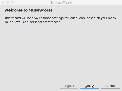
Musescore 3 UI/UX is even better. There is a very cool wizard in the beginning with a step by step tour! We should really consider this. There is also a basic and advanced setup option, which reminds me of this thread:
Engineer UX Mode.
Re: Case Study: Musescore (FLOSS cross-platform sheetmusic/scorewriter) UI/UX
Posted: Sun Sep 22, 2019 11:02 pm
by vocx
Apparently this video says that Musescore sucks:
Music Software & Interface Design: MuseScore
Re: Case Study: Musescore (FLOSS cross-platform sheetmusic/scorewriter) UI/UX
Posted: Mon Sep 23, 2019 9:09 am
by Kunda1
To be fair, he says he likes Musescore but there are some definite improvements to the UI/UX that would make sense.
He makes some very astute UI/UX points and in a comical way. Must of taken a ton of time and energy to create and edit that video.
FreeCAD could use a lot more of these types of videos. Reminds me of @sliptonic who made a '5 Ways FreeCAD will annoy (the xxxx out of) you' that got a bunch of views:
https://www.youtube.com/watch?v=R9KIa3_dJu8
So the youtuber does raise some really solid points that we can riff off of (even if it's for musescore), for example:
the
out-of-box experience (for new users), AKA How does an application orient new users to it's UI when they open it for the first time? This is not something FreeCAD has yet, but has been discussed before.
Note: here is the exact place he discusses it in the video:
https://youtu.be/4hZxo96x48A?t=1394
So in musescore they employ invasive popups that can be annoying. Tthe youtuber's suggestion is non-blocking popups. And he gives examples of how those would look. Essentially they will dismiss themselves in other wordss they don't require you to click them off to continue working, hence non-invasive.

(This is worth spinning off in to a whole other thread, actually)